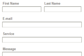
Creating web forms doesn’t sound like much of a challenge, but all of the small factors that determine higher or lower conversion rates indicate that this is a simple task that actually requires a bit of thought. Online forms are great tools for businesses because they allow people to contact the company without picking up the phone, opening up their e-mail, or dropping by the office. The less effort a person has to make to contact you, the more likely they are to do it. Unfortunately, a poorly laid out contact form can also hurt a business because leads are less likely to take the time to fill it out. If they fail on their first attempt to contact you, they most likely will give up entirely. Here are a few tips to keep in minding when creating web forms.
1. Tailor the Form to the Client and the Product
Online forms are used to get answers, sign up for a newsletter, request a quote, and much more. Every business offers something different and the size of the form should be proportionate to the size of the request. For example, someone signing up for a simple newsletter is not going to spend a good deal of time filling out a bunch of information. Only ask for the necessary information such as their name and e-mail address. On the flip side, companies can get away with using a larger form when a client is requesting a quote. In these cases, the extra information is necessary and allows the salesman to gather answers for the client before contacting them back.
2. Use a Simple and Well Designed Structure
Anything online must be visually appealing with a simple structure. If someone looks at a form that was sloppily thrown together with miss-aligned text boxes and formatting errors, they will leave the page. When creating your web forms, you want to make sure everything is uniform with right or left aligned labels next to the text boxes. Have you ever tried to fill something out but the label for the text box was in a strange place? If it was hard to figure out what information was supposed to go in each text box, you probably didn’t finish filling out the form. Keep your labels to the left of the text box or on top of it, do not put the label underneath because it needs to be the first thing people see. You don’t want to make your leads work in order to fill out your form.
3. Keep Descriptions Brief
In some cases, there is a need to explain what information is needed or offer a disclaimer. For example, you often see disclaimers about e-mail addresses being kept private. These messages are important but should not take up much room. Reading takes time and if the instructions or disclaimers are too lengthy, no one will look at them, salesman will get the wrong info, and time will be wasted. Wasting time is costly and the inability to respond to a client with the answers they want right away will lower your conversion rates.
[button type=”success” size=”lg” link=”https://bit.ly/1mkcJti”]Do you need help with Salesforce? Click here to learn about our Support Services![/button]
StarrForce creates and supports Salesforce solutions that allow our clients to take more effective action. If you would like information on the services we offer, call us at (888) 391-4493 x101.

